(SUPERHERO Enjoys conversations, brainstorming, drawing, dancing and drinks a lot of coffee.)


CASE STUDY
Site Restructure

OVERVIEW
CASE DETAILS
CLIENT
SKILLS Fund
TIMELINE
4 Weeks
OBJECTIVE
Evaluate and restructure Skills Fund’s current website information architecture to cleanly and smoothly simplify the navigation and content; focusing primarily on the Bootcamp Selector Tool and the school partnership pages. The goal is to have the site be both intuitive and functional so that more people can access bootcamps and other outcomes-based education programs.

SUMMARY
Skills Fund wants to increase their loan conversion rate by 10%. In order for that to be achieved, the site needs to be restructured in a way that matches the current students’ mental model of loan processes. Preliminary research and testing helped the team gain a better understanding of both our primary and secondary users. Primary users are the students who come to Skills Fund to take out a loan and the secondary users are those who come to Skills Fund to conduct research. As a team, we worked on proposing solutions for both audiences.
Research findings indicated that the most important features for both users were; Cost, Duration and Location. Having important features and current pain points in mind from affinity diagramming, we developed problem statements, design principles, task flows site maps and other ideas to refine plausible solutions.

PROCESS
SITE RESTRUCTURING FOR SKILLS FUND
Research
Interview
Generative
Market Research
Strategy
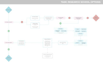
Task Flows
Journey Map
Data Synthesis
Interaction
Wireframes
Prototype
Usability Test
Client Handoff
Final Deliverables
Sketch Library
Annotated Wireframes
RESEARCH
Our team conducted a competitive analysis on our client's list of provided top competitors. Using the data that we discovered we additionally conducted 3 subject matter expert interviews and 10 user interviews to gain further knowledge of the loan process and current students' pain points along the way. We were able to use the current Skills Fund site with primary users to assess what solutions we could work towards to achieve the client goal.
We found that students were lacking knowledge of the loan terms and process itself, especially regarding price breakdowns of the student loans, interest/duration of loans and income share agreements. The data we gathered showed us that 66% of users felt that the cost, 66% of users felt that having the ability to compare costs and bootcamps, and 50% of users felt that the location, were top priorities for them in deciding on a bootcamp and loan provider.

There's gotta be a way to look at interest rates... and help them feel informed about the decisions they're making.
STRATEGY
Our persona (provided by Skills Fund) allowed us to work as a team and create viable solutions for their audience. How can we provide users with a transparent way to determine that Skills Funds products are the best financial option for them, and how can Skills fund aid in users deciding on which bootcamp and funding options are right for them. We were able to assess current pain points like clearer descriptions of loan terms and call to action buttons. Creating a journey map and brainstorming ideas allowed us to creatively think of opportunities for improvment. Transparency, intuitiveness and empowerment are the principles to be conveyed as we establish product solutions.


I think for the loan calculator... the more playful (the better). Trying to envision myself in different scenarios is important.


INTERACTION DESIGN
Synthesis and ideation followed by idea convergence brought new ideas to test. The information architecture was restructured to match the mental model of users. Mid-fidelity wireframes emerged and an InVision prototype was ready for assessment. The opportunities from the journey map were expanded upon to see if pain points could be remedied for our users. Clear call to action buttons, revised information architecture, step-by-step processes for filtering, finding and comparing programs and/or loans, were all ideas that we wanted to test.

Affinity diagramming showed that the solutions were heading in the right direction and that our vision was in alignment with Skills Fund. Some of the feedback received that we further refined before moving forward with more testing was the locations of certain elements, further explanation of loan terms and mental model matching for wording.
Much thought and data synthesis went along with the testing for us to present to our client. Future recommendations for the product and our suggested solutions were very successful and well received. The interactive map tool/Bootcamp Selector tool and filtering processes were some avenues that we felt Skills Fund should pursue.


FINAL HANDOFF
Annotated wireframes along with all working sketch files, sketch libraries and assets were provided to Skills Fund. Presentation slide decks of the condensed progression throughout the process were also provided for documentation.